Client Work
Fashion Press Website Redesign
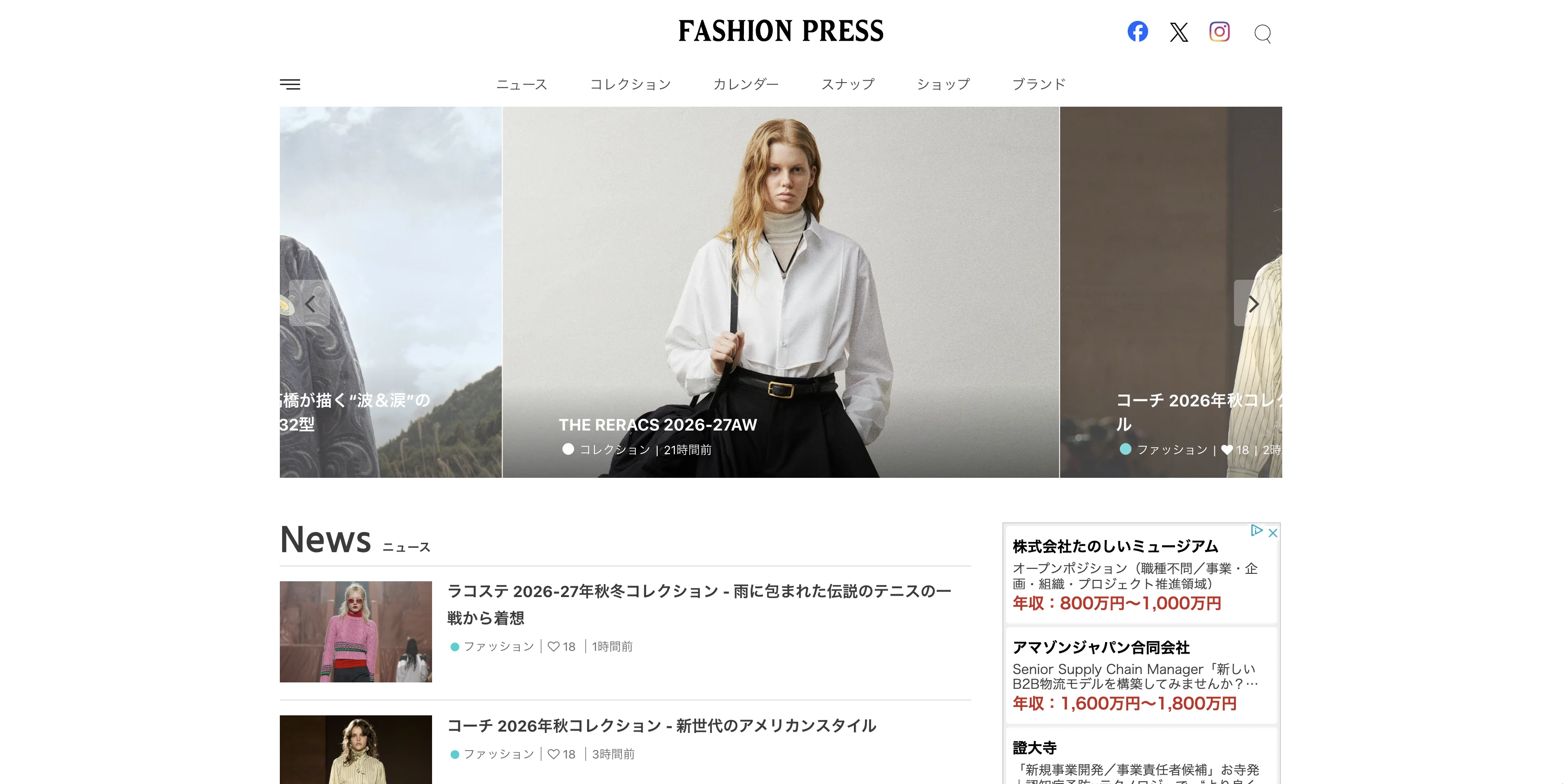
I was responsible for the information architecture, UI/UX design, web design, and front-end development for the redesign of the Fashion Press website.
- Client
- Carlin,inc.
- Role
- Information Architecture ,UI/UX Design .Web Design .Front-End Development
- Duration
- 2016.04 - 2018.05
- Tools
- Photoshop ,Illustrator ,HTML ,CSS ,JavaScript ,Ruby on Rails
Fashion Press is a web media platform that delivers the latest news and information on fashion, beauty, lifestyle, gourmet, and culture. I contributed to the full redesign of the website, handling information architecture, web design, and front-end development.
【Target Audience】
The website targets a broad audience ranging from people in their 20s to 50s, with an approximate user ratio of 30% male and 70% female.
【Objective】
The previous website was not responsive, so the redesign aimed to modernize the entire experience while introducing full responsive support. Because the site publishes a large volume of news articles, the primary goal was to create an interface that remained easy to navigate and read despite its content-heavy nature.
【Information Architecture】
I organized the site's content by determining what information should appear on each page while carefully considering the user journey. Particular attention was given to creating navigation paths that encouraged users to continue reading related articles, as well as designing layouts that balanced editorial content with advertising placements. Since the website contains a large number of pages, building a scalable design system and organizing reusable UI components was one of the most time-consuming aspects of the project.
【Design】
Although the previous black-themed design conveyed a stylish impression, I believed a cleaner visual language would better suit the site's broad audience. The redesigned interface adopted a white and light gray color palette with vivid pink used as the accent color.
The visual direction was inspired by the clean, minimal aesthetic popular on Instagram at the time. To improve readability across the site's large amount of content, I increased whitespace throughout the layouts, creating a lighter and more organized reading experience.
Visit website ↗ 【Target Audience】
The website targets a broad audience ranging from people in their 20s to 50s, with an approximate user ratio of 30% male and 70% female.
【Objective】
The previous website was not responsive, so the redesign aimed to modernize the entire experience while introducing full responsive support. Because the site publishes a large volume of news articles, the primary goal was to create an interface that remained easy to navigate and read despite its content-heavy nature.
【Information Architecture】
I organized the site's content by determining what information should appear on each page while carefully considering the user journey. Particular attention was given to creating navigation paths that encouraged users to continue reading related articles, as well as designing layouts that balanced editorial content with advertising placements. Since the website contains a large number of pages, building a scalable design system and organizing reusable UI components was one of the most time-consuming aspects of the project.
【Design】
Although the previous black-themed design conveyed a stylish impression, I believed a cleaner visual language would better suit the site's broad audience. The redesigned interface adopted a white and light gray color palette with vivid pink used as the accent color.
The visual direction was inspired by the clean, minimal aesthetic popular on Instagram at the time. To improve readability across the site's large amount of content, I increased whitespace throughout the layouts, creating a lighter and more organized reading experience.